
(Written jointly with Jens von Bergmann and cross-posted at MountainMath)
We’re increasingly gathering lots of different measures of residential mobility in Canada. Which is great! Especially insofar as we want up-to-date information about demographic response through the pandemic. Here we want to add the CMHC Rental Market Survey (RMS) to the mix, comparing to Census and CHS (Housing Survey) results. Adding it in reveals a general decline in tenant mobility only recently (and partially) reversed. But it also raises a mystery worth solving about divergent CHS results and points toward the value of triangulation.
The CMHC Rental Market Survey
In CMHC’s Rental Market Survey there are several bits of information that tell us about residential mobility, namely the vacancy rate, the availability rate, and the turnover rate.
The vacancy rate tells us what share of units are currently not rented and are looking to get rented out. This measures how easy it is for tenants to find new accommodation. A very related metric is the availability rate (now discontinued), which on top of the vacancy rate also considers units where that are still rented out but the current tenant has given notice and it has not yet been rented out to a new tenant.
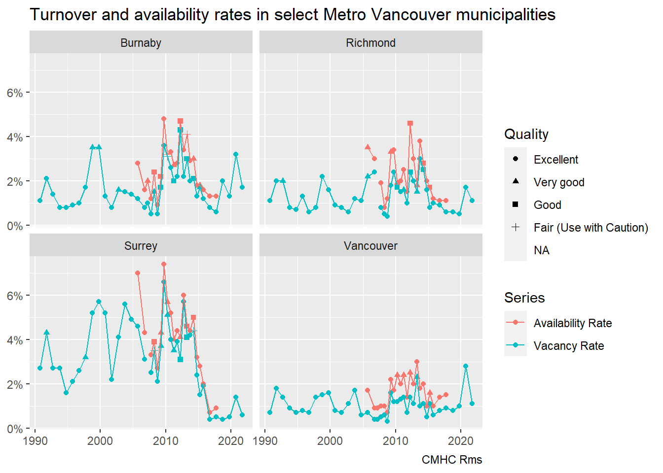
Vacancy rates, in particular, are familiar to most analysts, and we’ve written about them a lot. They’re particularly good at tracking whether we have enough rental apartment stock.
Spoiler: we do not. And more broadly the primary and secondary rental market are to a large extend fungible as we have noted before when comparing vacancy rates across these markets, even if the primary market generally provides better renter protection and services. Which means that secondary market rentals are also helpful in filling this gap, all housing helps.
Turnover rates
The turnover rate measures how many new tenants have moved into a unit during the past year. It is expressed as the total number of new tenants moved in during the past year divided by the total number of units. This measures residential mobility in the primary rental market.
CMHC started measuring this in 2016 and has reported it for every Rental Market Survey (RMS) since then. Unfortunately we aren’t aware of a single clean data source for turnover rates, so we turn to Excel files for the 2019 through 2021 Market Rental Reports and scrape it from the tables in the PDF reports for the years 2016 through 2018. This only yields high-level data for metro areas. It would be good if CMHC could put this data out in more easily accessible form, preferably as part of the Housing Market Information Portal.
Taking a comprehensive look at the CMA level data, ordered by mean turnover rate over our six years, we see a wide spread in turnover rate across CMAs and across years.
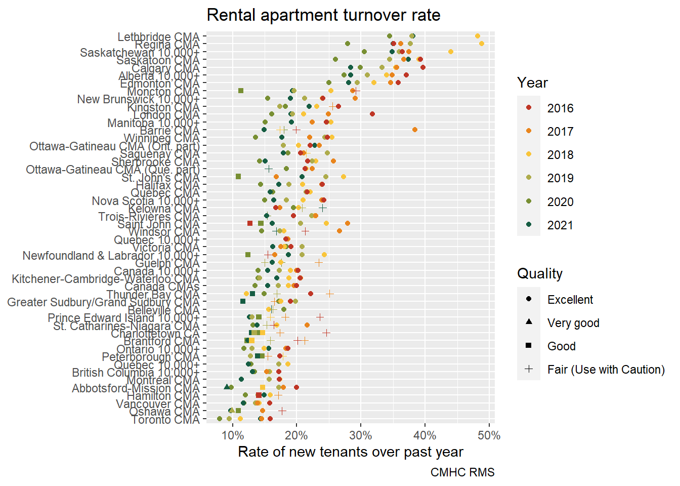
Unsurprisingly, tight rental markets like Toronto and Vancouver come out with very low turnover rates, indicating the lack of housing choices. This is in line with data from the Canadian Housing Survey showing a low propensity of choice moves for overall (primary and secondary market) renters in these regions. This is likely amplified by long term renters benefiting from rent control, which enables choice stability but also discourages choice mobility by accumulating a moving penalty due to market rents increasing significantly faster than in-place rent-controlled rents. Provinces with more stringent rent control – at least on the books – include BC, MB, ON, QC, and PEI (handy abbreviated guide here).
Of course, 2020 was a special year in this regard, with moratoria on evictions and rent freezes widespread through the early months of the pandemic. We might expect many tenants to have largely hunkered down in place. On the other hand, we might expect other tenants to have moved, following disruptions to workplace and lifestyle. Indeed, we have preliminary evidence that young adults moved back in with their parents during the early months of the pandemic. More recently, pandemic protections for tenants have expired at the same time that rental markets appear to have tightened again.
Looking more closely at turnover rates allows us to peek at how they’ve evolved over time, both up to and through the pandemic. Eyeballing the graph it looks like turnover rates were higher in the early years and lower later, with 2021 possibly breaking from this trend. To understand this in more detail we zoom in on several CMAs and plot the trend over time, treating 2021 separately.
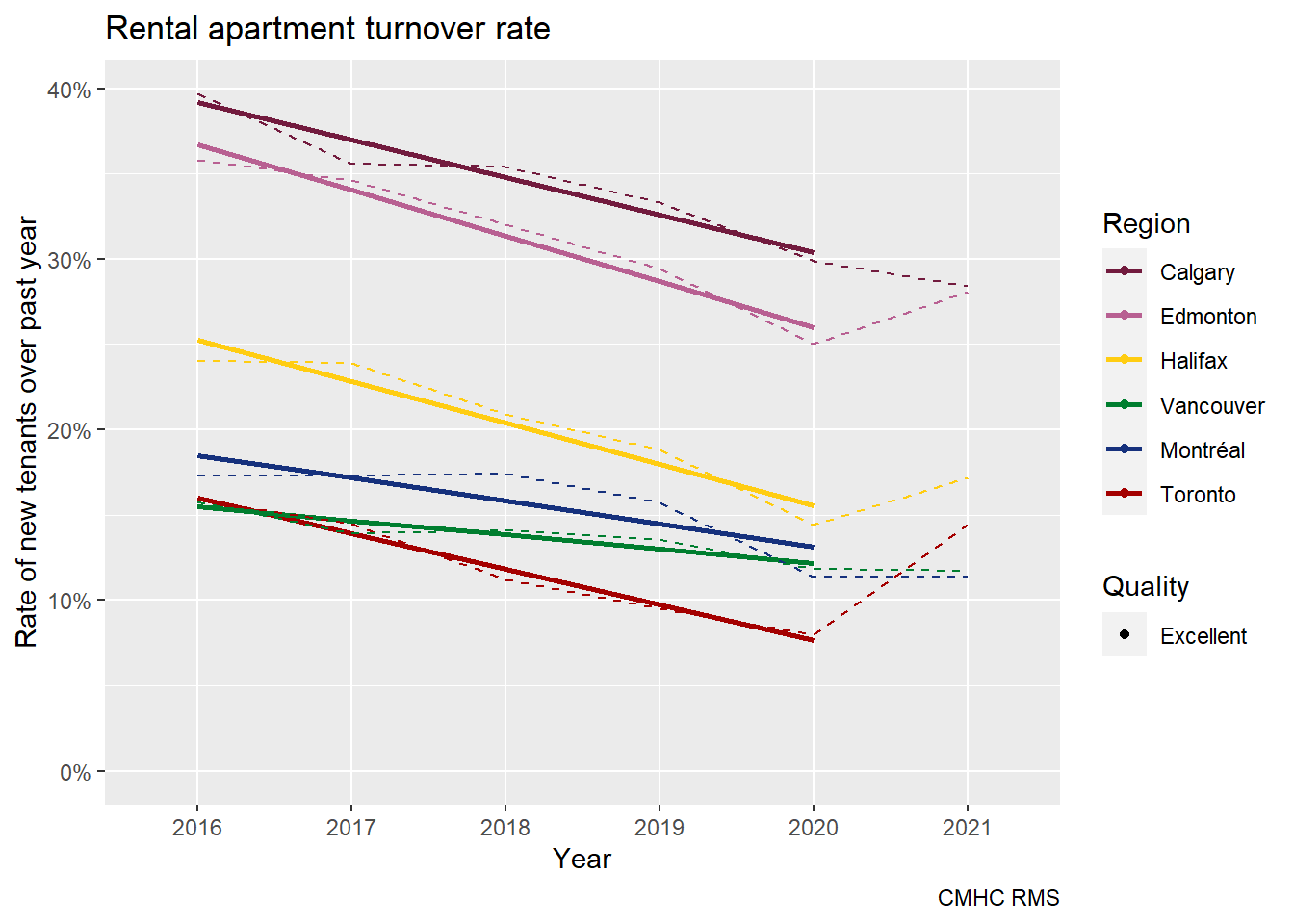
Overall, trends for Calgary, Vancouver and Montreal seem largely unaffected by the pandemic, but Toronto, Halifax and Edmonton show significant recent increases in mobility. Is this evidence of recent differences in residential sorting processes across metro areas?
There are several plausible factors that can impact turnover rates, ranging from physical like unit mix and location, to demographics like age and share of students, non-permanent residents and recent immigrants which tend to have higher mobility rates. Moreover, mobility rates may be impacted by the mixture of primary and secondary rental market housing stock, with people with higher mobility rates sorting into the less stable secondary market and people looking for more stability more willing to pay the premium of renting in the primary sector.
That said, none of these factors seem obviously consistent with the data shown above. More work might be needed to sort out what’s going on. We should probably start by checking on how turnover data stacks up to our other measures of residential mobility for tenants.
Cross check with other data sources
To better understand the primary rental apartment mobility rates we can compare them to two other data sources that (roughly) intersect our time frame, the 2016 census and the 2018 Canadian Housing Survey (CHS). We start with the census, which we just recently used to understand overall mobility rates, and how they depend on CMA, age and tenure.
Importantly, our mobility rates are constructed differently as we switch data sources. In our numerator, we shift from all new tenants moving through primary rental apartment stock within the past year to examining currently resident tenant households of similar structures (see below) who’ve moved in the last year. So the Census and the CHS capture a similar, but slightly different group of tenant households, but record no more than a single move per household. In our denominator, we shift from dividing by total primary rental apartment stock (i.e. including vacant apartments) to dividing by total currently resident tenant households of similar structures (i.e. excluding vacant apartments). In short, these are slightly different measures. But if carried out correctly, they ought to line up pretty well with one another.
Census data
To find similar structures to those recorded as primary rental apartments in the CMHC survey, we will focus on households in non-subsidized apartment rentals that aren’t part of a condominium development. In absence of suitable cross tabulations we default to using PUMF data. Wanting to filter by dwelling type forces us to use the hierarchical PUMF, and even there we don’t have the ability to distinguish people in “duplex” apartments from non-stratified apartments that are closer to what the Rms might capture.
Before we do this we want to get an overview how mobility rates depend on different types of housing.
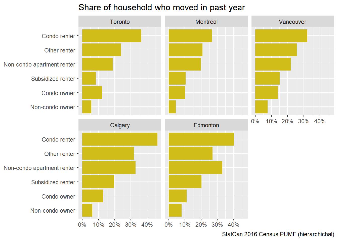
These are pretty interesting results in their own right. They show a clear hierarchy of tenures in relation to residential mobility. It stands to reason that non-condo renter rates are somewhat higher than what the RMS finds in the purpose-built rental stock because it also includes secondary suite rentals. We can compare the data from the Census, which was held in May 2016, to the RMS data from October 2016, understanding the problem with counting secondary suites in the census data; counting possible multiple turnovers in the RMS data; and dropping tenants recorded as resident elsewhere in the Census. The census will also count renters in newly built units, which should show 100% mobility rates, whereas the RMS turnover rate will exclude those.

This shows that for Vancouver, Toronto and Montreal the census comes out with higher mobility rates while Edmonton and Calgary show lower rates compared to the RMS (Rental Market Survey). With Calgary and Edmonton showing very high mobility in the census of upward of 30%, it is quite reasonable to assume that the difference may be driven by multiple turnovers within a year, using the naive heuristic that if about one third of the units turned over at least once, then a little under one third of the units that turned over turned over more than once, with total turnover roughly matching the RMS numbers.
On the other hand, the higher census mobility rates in Vancouver and Toronto may well be explained by secondary suite rentals slipping into the non-condo apartment mix. In summary, the turnover rates of the two data sources are plausibly consistent.
CHS data
Let’s take a look at the CHS data. The definitions are a little different here than in the census data: apartments don’t include secondary suites in this case and subsidized units are tied to the type of housing and can’t be cash subsidies like in the census. We also get information on whether tenancies are “arm’s length” between tenant and landlord (e.g. not one family member renting to another).
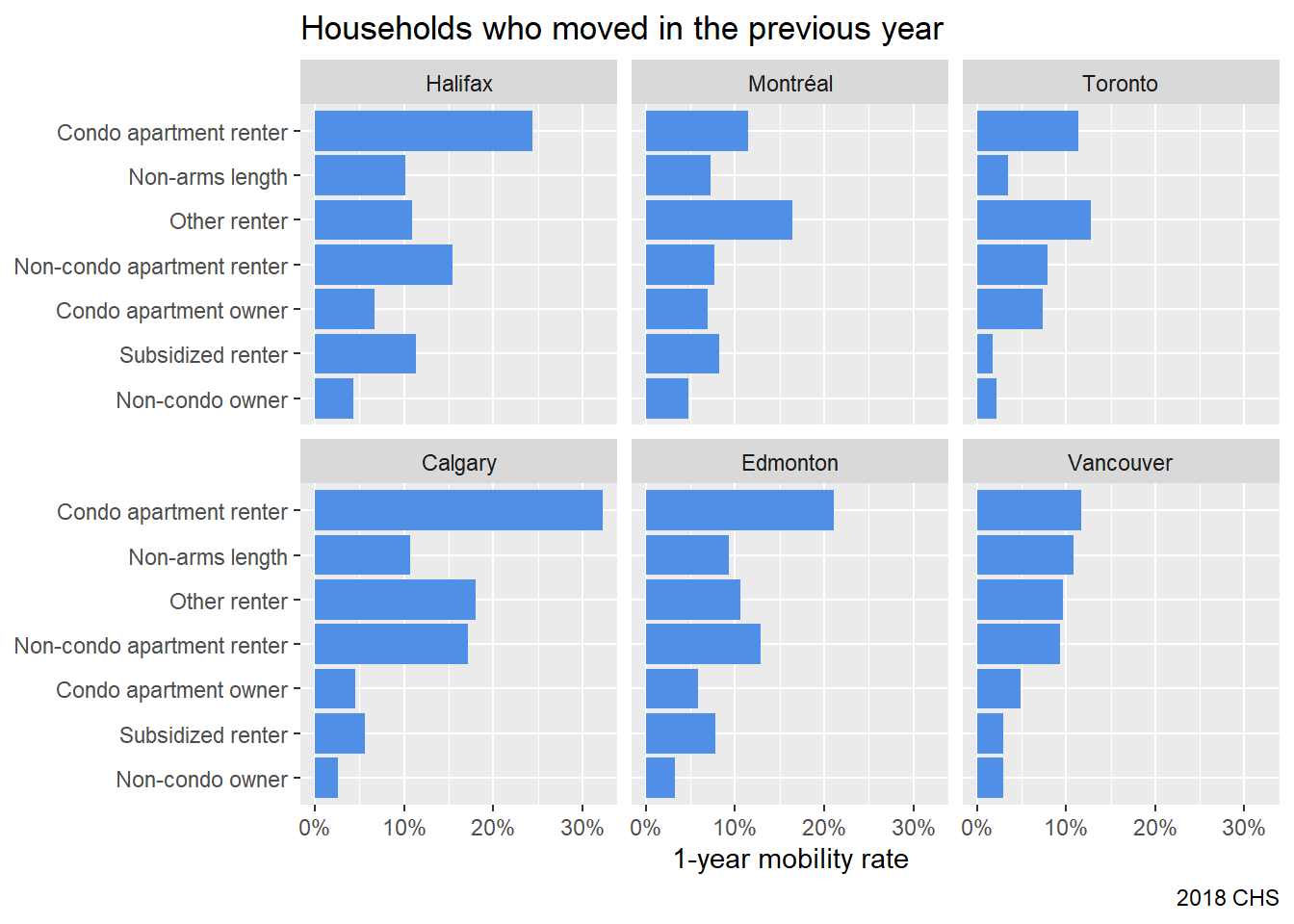
Again, we notice a strong dependence on the type of unit, but it’s less clear-cut across CMA. Three other things stand out. First it’s remarkable that in Toronto mobility in subsidized units is extraordinarily low. Second, Vancouver stands out with a high share of people moving into non-arms length rentals, which we define here as rentals not rented by “a government” or “a private company or individual”, but instead by “a relative, an employer or other”. Third, and most notable in context, overall mobility rates look quite a bit lower than what we would expect from looking at the census.
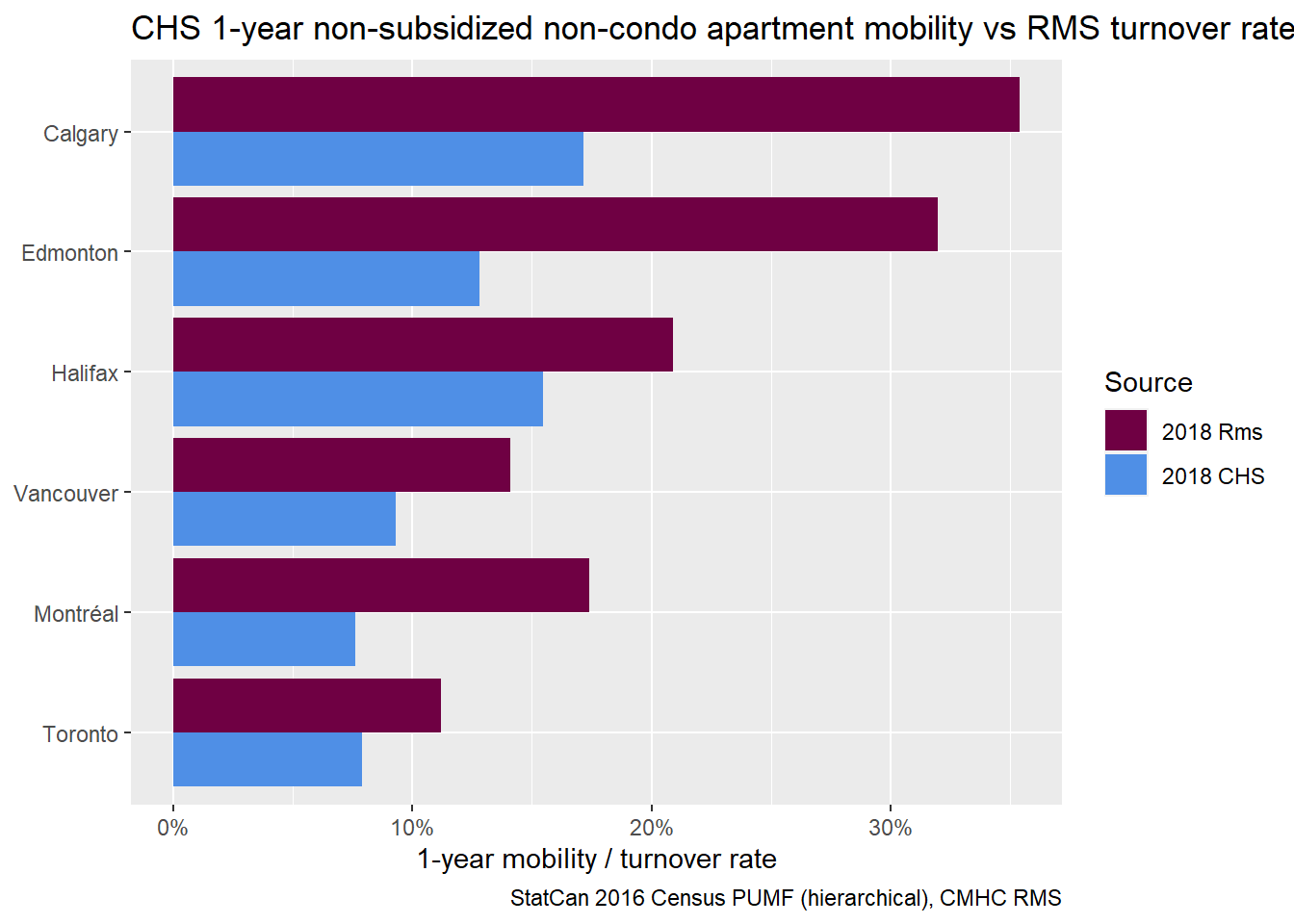
This is a bit baffling, the differences are quite large, the CHS shows implausibly low mobility rates. We can plot all three data sources on the same graph.
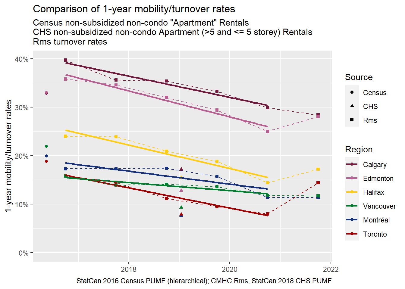
Again, the CHS mobility rates are implausibly low. Even though Census to CHS drops match the trend line from RMS over time, they look too low relative to those trend lines. What’s going on? It’s a mystery!
Cross-checks with 5-year mobility and overall mobility rates
Let’s check in on 5-year mobility rates and cross-check with the Census. These should be less sensitive to short-term variation, and also plausibly to undersampling recent movers. Here we can even add in the just-released 2021 CHS comparison (though we can’t yet match it up to Census 2021).
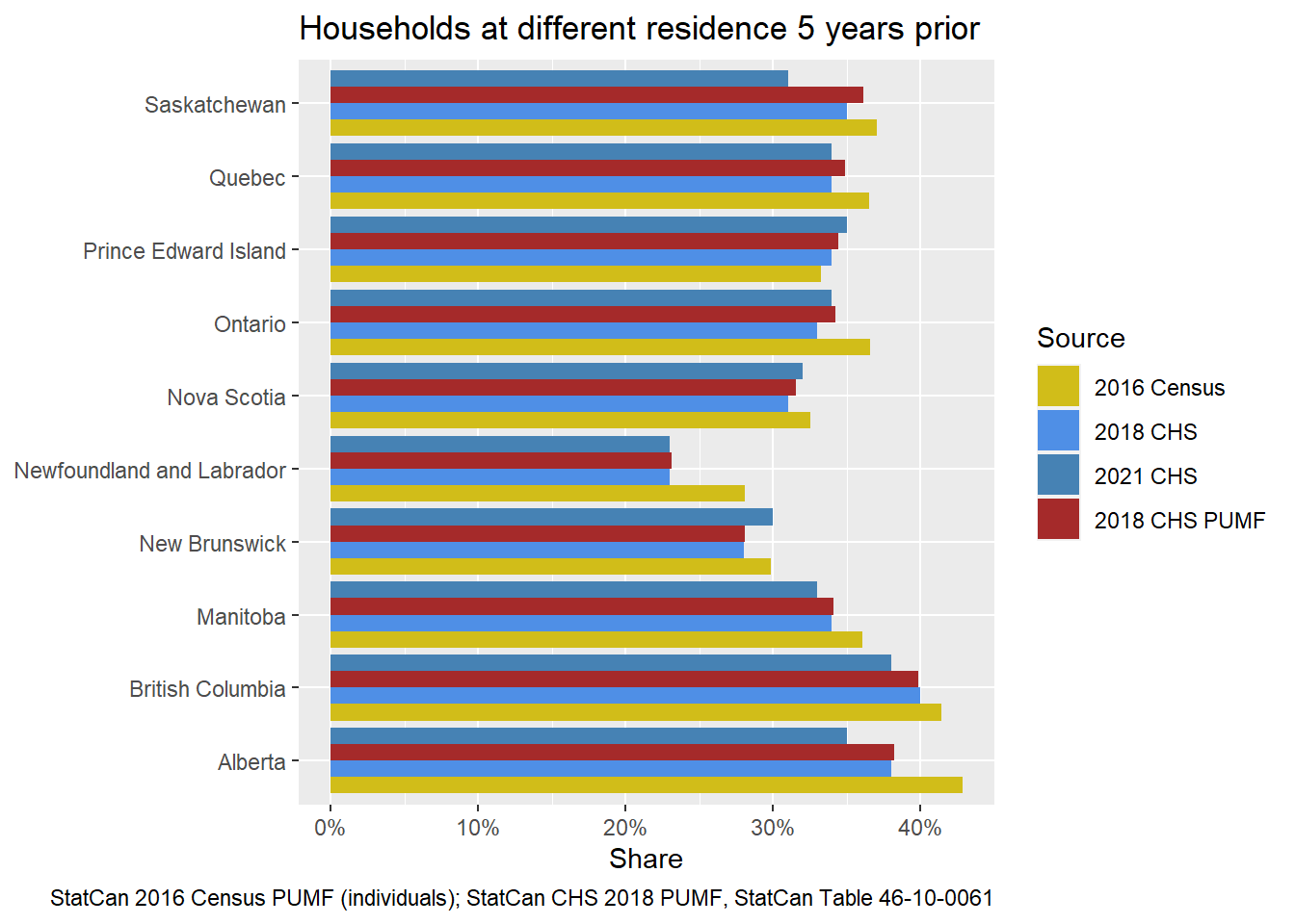
There’s differences here, but none are especially notable, and they could be explained by sampling and/or historical variation. Census 5-year mobility rates match relatively well both with StatCan tabulated results from the CHS for both 2018 and 2021, and with the Public Use Microdata File (PUMF) results. In other words, we don’t appear to be missing or undersampling movers across the 5-year survey frame.
Let’s go back to the Census to CHS comparison for 1-year mobility rates. Below we can really see just how stark the differences are between Census results and CHS.
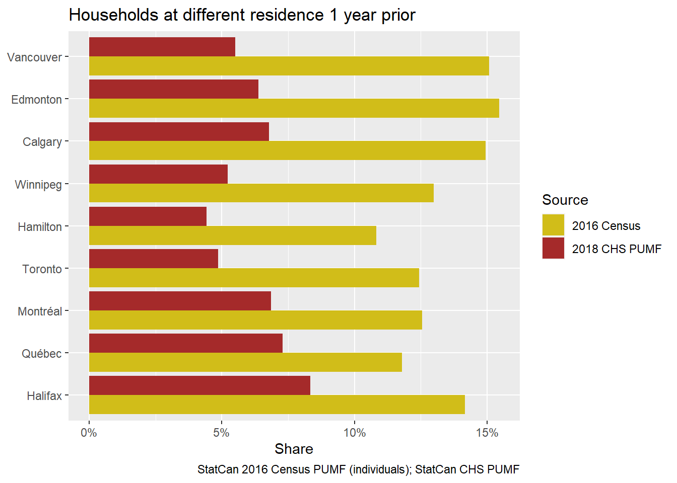
Clearly there’s an issue emerging only for recent movers, those moving within the past year in the CHS data. Are they being undersampled? This seems possible… but there’s another intriguing potential explanation.
Data collection for the CHS was carried out between November 2018 and March 2019. This is different from the Census, which was carried out from May through July of 2016. Is it possible that spreading data collection across two years mattered? Let’s compare questions asked.
The 2016 Census long-form questionnaire asks about where people lived on a specific date one year or five years prior to when data collection begins (May 10th, 2015), e.g.
Question identifier 22: Where did this person live 1 year ago, that is, on May 10, 2015?
The 2018 CHS questionnaire asks about most recent move.
Question identifier: PAC_Q05
When did you move to your current dwelling?
Would you say:
01: Less than 1 year ago
02: 1 year to less than 2 years ago
03: 2 years to less than 3 years ago
04: 3 years to less than 4 years ago
05: 4 years to less than 5 years ago
06: 5 years to less than 10 years ago
07: 10 or more years ago
08: Always lived here
There are at least two ways these different questions could result in different estimates of the timing of a recent move for the same person. Given that Census data collection runs from May through July, they may be picking up between 12-14 months of moving risk in their estimates of one-year mover rates. By contrast, the CHS question specifies exactly one year as its cut-off for estimating one-year mover rates. But the CHS data collection also crosses a threshold from one year to the next. This makes it entirely possible that people benchmark their move not from the time of survey, but what year they moved. So those moving in, say, June of 2018, but surveyed in February of 2019, might declare their move as occurring “1 year to less than 2 years ago” – because it occurred last year – rather than “Less than 1 year ago,” which is what we’d want them to choose to get our one-year mover rates. In short, the different questions and procedures of the Census might be systematically overestimating one-year mover rates while the CHS underestimates them.
If some respondents benchmarked their responses to calendar year in the CHS instead of estimating backward in months from survey date, it could systematically push the reported timing of their last moves backward. Do we see this kind of movement in the CHS data? Since the CHS breaks down the timing of most recent move in yearly intervals, we can take a look!
By way of a primer, we might expect our one-year mobility rates to remain constant for each year prior to the survey, assuming people had the same risk of moving for each year in their past. Or, more accurately given the selectivity of movers (movers tend to move more often), we might expect that mobility rates tend to be highest for the most time period, which catch the most frequent movers, then decline for moves further in the past, where frequent movers are less represented. But if enough people are benchmarking to calendar year for past moves instead of indexing by month, then our estimated mobility rates will systematically shift those people backward, growing higher if we go back further, until the effect of frequent movers takes over.
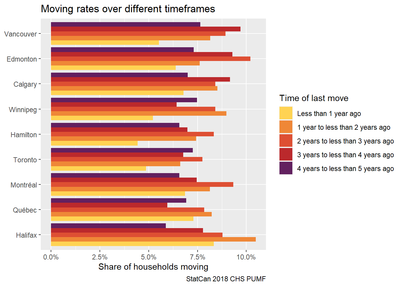
Sure enough, our one-year mobility rates climb the further back we go, mostly peaking somewhere in the middle. In many regions it looks like the 1-2 year mobility picks up the slack left by the 0-1 year mobility shares, providing some possible supporting evidence that there may be issues with how people benchmark their responses to the CHS timing of last move survey question. Definitely worth looking into further.
Another way to look at this is to convert the data to 1-year equivalent mobility rates based on aggregate movers up to n
years back. This attempts to account for frequent movers and is a cleaner way to view mobility rates.
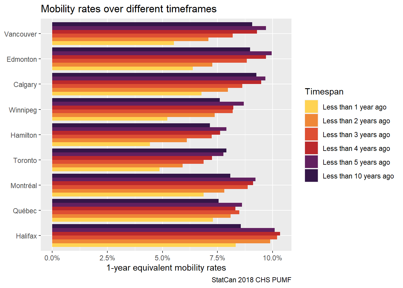
Again we see similar patterns, and the “Less than 2 years ago” bracket looks in line with the other brackets, again suggesting that the 0-1 and 1-2 year mobility rates are impacted by how people understand the question. This is of course overplayed with possible changes in overall mobility, where e.g. Halifax looks fairly stable of this timeframe and some other regions showing drops in (estimated) mobility rates. We also observe a drop in the much larger range (up to 10 years ago) bracket, which likely reflects the effect of frequent movers.
One takeaway from this is that maybe Canadian Housing Survey results should be “adjusted” for comparability. 1-year mobility rates using 1-year equivalent mobility rates (as per above) based on the cumulative movers in the past two years might be an acceptable proxy for actual 1-year mobility rates. We can try that out by plugging those into our previous graph comparing mobility rates over time.
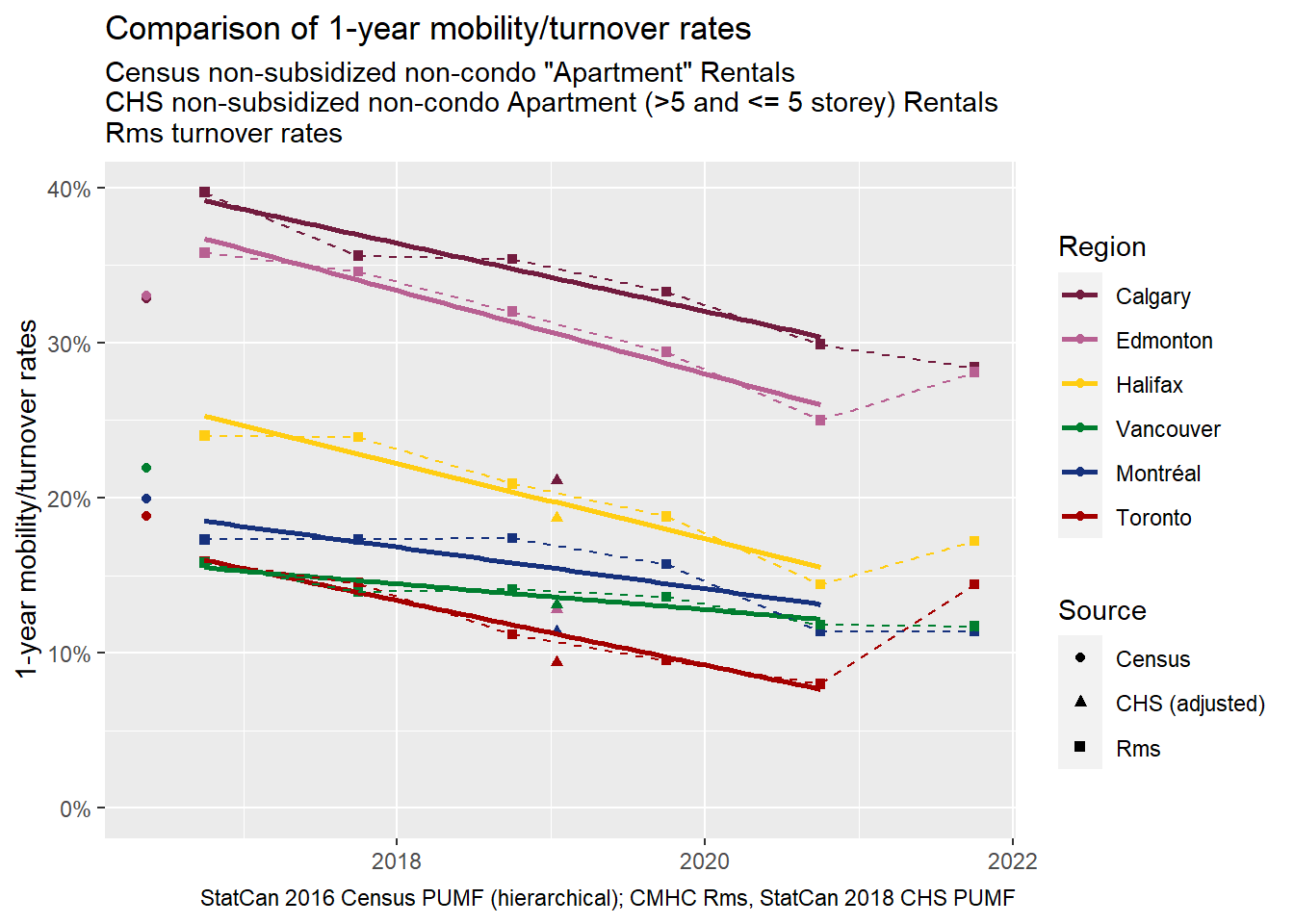
Better! There are still noticeable differences between the sources, especially for Edmonton and Calgary which see much lower “adjusted” mobility rates in the CHS than in the RMS, but this moves us in the right direction for enabling comparisons across data sources.
Takeaways
Are different questions and procedures (along with trends over time) enough to account for the different estimates of one-year mobility rates between Census and CHS? Maybe. We don’t know. But returning to the CMHC’s Rental Market Survey Data we can see that its results more closely line up with the Census. And that’s part of why we’re so glad to have another source of data on mobility!
Our last takeaway returns us to the trends at hand. Including turnover data, we can clearly see a pattern operating across data sources where tenant mobility in purpose-built apartments seems to be generally on the decline, with evidence of some recent bounceback. As we’ve noted in the past, declines are only good insofar as they reflects declines in forced moves, but they’re mostly bad insofar as they reflect declines in choice moves. Protections against eviction generally increased through the pandemic, just as vacancy rates rose in many big cities. Both of which should lead to more choices. Unfortunately, these trends have since reversed in many places. That leaves our worrisome longer-term evidence of tumbling turnovers, which we’ve also seen linked to negative trends in the USA. Worth keeping an eye on!
