Good Age-Specific Net Migration Estimates Come in Threes!

Recently I posted on how we’re still not seeing any big age-specific losses in net migration figures in Metro Vancouver following the release of 2016 Census data. To summarize, there is STILL no flight of the millennials, BUT maybe there’s a slow leak of the Baby Boomers, which might be seen as evidence of “cashing out” of the local real estate market.

Today I wanted to provide both some metropolitan comparisons to note how Vancouver’s patterns fit with a couple of similar places, and also some municipal comparisons within the Metro Vancouver area. I also wanted to make some technical adjustments in how I modeled mortality* as I aged people through the past five years to estimate net migration, which really matters for older adults (not so much for the young). Again, I’m using 2011 and 2016 age distributions drawn from census profiles to get at age-specific net migration estimates for each of the metro areas and municipalities below.

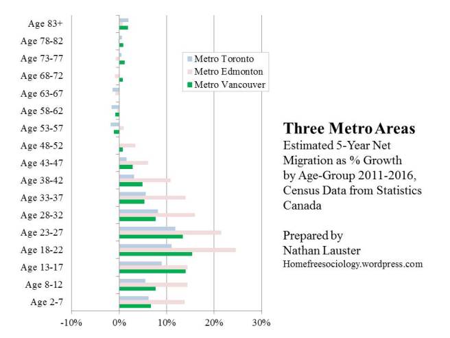
First let’s compare Vancouver as a metropolitan area to two other metro areas: Edmonton and Toronto. I like this comparison primarily because Vancouver is nestled nicely between these two areas in terms of size, and they’re all big university towns.

ThreeMetroNetMig-2016

For Vancouver, you may notice that the figure looks very similar to what I posted two days ago, up until you get to folks in the 70s and above. That’s where mortality effects really start to matter! I think the above is a better approximation of those effects, but it’s tricky to get them right.

Comparing Vancouver to Toronto and Edmonton, what stands out most for me is just how similar these three metropolitan areas look! Metro Edmonton has grown faster over the last five years in % growth terms, but age-wise, the basic pattern of growth is the same as in Metro Vancouver or Metro Toronto. Young people (including Millennials) pour into all three of these areas, and then mostly stick around.

I noted in Vancouver there was new evidence (at least new to me) of a slow leak of Baby Boomers over the last five years. It appears this leak is also showing up in Metro Toronto, with a very similar pattern. It appears there are fewer folks in their late fifties and sixties than might be expected, suggesting they’re leaving town (cashing out?). Then people in their seventies and above start returning (probably for the good health care & related facilities).

There is also a later-life leak of Metro Edmontonians, but it starts later and never quite stops until the latest age. This could reflect more of a straightforward retirement and return home effect for the many folks drawn to the region, but it’s hard to say. At any rate, all later life migration patterns are dwarfed by the influx of younger adults (and their children) into these growing regions. I don’t see a lot of cause for concern about any particular age-groups shying away from our rapidly growing metro areas.

What about within Vancouver’s metro area? I’m somewhat ambivalent about emphasizing municipal differences in age-specific net migration patterns insofar as metropolitan areas tend to be tightly integrated. When a group disproportionately moves over the border from one municipality to another, it doesn’t have a big impact on the vitality of the region as a whole. Nevertheless, it’s worth tracking, and it certainly can have big implications for quite local livability, diversity, development, and transportation questions.

Here I’m just going to compare Vancouver and Surrey, the Lower Mainland’s biggest two municipalities, with Maple Ridge, a smaller suburb further out.

ThreeMunisNetMig-2016

Here you really get a sense of how tightly connected central cities and their suburbs can be. As the region’s central city (and biggest university town), Vancouver receives an ENORMOUS influx of young people. Then, as they move into their thirties (and often start having children of their own), they tend to move out again, slowly leaking out of the City thereafter. Nevertheless, so many young adults move to the City of Vancouver that they overwhelm the later leavers. In net terms, the majority of young adult arrivals stick around in the City of Vancouver all through their later lives.

But back to the leavers – where do they go when they leave? Mostly to the suburbs. Maple Ridge is the City of Vancouver’s mirror image in this regard. People in their thirties and beyond account for most of this suburban municipality’s growth. By contrast, young adults, especially of university age, but extending into the twenties, flee Maple Ridge. Where are they going? (see above).

What about Surrey? It’s still a suburb, but also increasingly a centre of action in its own right within a multi-polar metropolis. At the moment it’s hit a sort of demographic sweet spot where it’s gaining people at all ages. Nevertheless, it’s worth noting that while young adults aren’t exactly fleeing Surrey, their contribution to its growth isn’t as strong as for older adults or their children, and it remains nowhere near as strong as what we see in the City of Vancouver.

On the whole, these net migration patterns are not too surprising for a relatively large metropolitan area. Young people tend to leave home and move toward the vibrant city centre. Later they tend to move back to the suburbs as they settle down and start families of their own. If anything, what’s striking here is just how many young people remain in the City of Vancouver as they age, living on their own or in diverse families across a wide array of the different housing options the City is working to provide – if still, typically, at too great an expense!


*- my mortality modeling from my earlier post was really crude – simply applying five years of the expected death rate to the starting (2011) population. Bad demographer, bad! Now I’m using BC Deaths data to apply a survival rate and age the population from 2011 year by year, for each of the past five years, allowing one-fifth of the population in any given age group to age to move to the next mortality risk with each year and then applying the survival rates to the surviving population in sequence. This still doesn’t account for the mortality of recent migrants (in other words, recent arrivals could die and never be counted by the census, and I don’t take into account their mortality in any separate fashion – if I did it would boost the net migration estimates, especially for older adults). I’m also twiddling a bit with my estimates for 0-4 year olds and 85+ year olds, as needed by modeling (infant mortality is much higher than any year afterward until quite late in life, and after 85 I’m dividing the population into about half experiencing 85-89 vs. 90+ mortality). But I think I’ve got most of the technical details now closer to realistic for estimation purposes. As noted previously, none of this really matters much for younger population groups.


Update: The Lifeblood of Vancouver still isn’t leaving!

New Census results out today from the 2016 Census! They include dwelling type, age, and sex figures. The former is of great interest to me, but I’m going to concentrate on the latter just to update my older posts on migration patterns for Metro Vancouver.

Behold, the lifeblood of Vancouver still isn’t leaving!

NetMigration-2016update

I followed the same basic procedure here as I described in previous posts, comparing 5-year age groups across 5-year census periods. For example, given how many 20-24 year olds we had in Vancouver in 2011, how many 25-29 year olds would be expect to be here in 2016? Without any net migration, we’d expect roughly the same number, subtracting a few who died. So if we compare population figures, and make minor adjustments for mortality (I used 2013 figures, drop me a line for details [UPDATE: I think I’ve made better technical assumptions about late life mortality effects in this later post, reducing net migration estimates from age 70+]), then we can estimate net migration by how many more (or less) people show up in 2016 than we’d expect. I use the intervening age intervals (e.g. 23-27 year olds) as labels to demonstrate where most of the in-out movement is taking place between census years, which I find really captures, for instance, those university years (18-22) well.

The big takeaway, given the frequent concerns expressed over millennials leaving Vancouver,* is that it’s STILL NOT HAPPENING! Young people continue to pour into the region (University town, vibrant urban scene, etc.), and they tend to stay well into their forties.

What does appear to be new this year, at least according to my calculations (which are heavily dependent upon mortality assumptions as the population gets older), is that we’re starting to see a net loss of our late-career / early retirees. These are folks in their fifties and sixties. Yes, yes, the slow leak of our Baby Boomers is upon us! Apocalypse Now! (to be fair, it is their movie…) It’s quite possible these are predominantly people cashing out on their investments in the local real estate market and leaving for elsewhere. But if so, that’s about the only age-specific migration trend I’m seeing that seems driven by Vancouver’s widely unaffordable real estate.

*- I’ve still not seen any calculations or corrections on this issue from Bloomberg. Show your work! Tell us where your bad data is coming from! It’s ok to get stuff wrong, but not ok to keep false stories running!

Where are babies made? – Metro Vancouver edition

I’ve been trying to track down good total fertility rates (TFRs) for Metro Vancouver for a while now, all part of a larger project of mine to better track demographic responses to housing (un)affordability. You can see powerpoint slides from my recent talk on this topic at the Pacific Housing Research Network (PHRN) and BCNPHA sponsored 2016 Housing Central conference. (PHRN has a call out now for abstract submissions to the 2017 conference!)

In my search for demographic responses, I’ve been playing around a lot with migration data, and I don’t yet really see much of a response to our housing affordability issues in terms of overall migration or age-specific rates. The millennials aren’t leaving. At least not yet – we’re still waiting on that 2016 Census data for confirmation! Also: there may be other types of out-migration we should be paying attention to.

But what about demographic responses to housing unaffordability in terms of fertility? Are people having fewer babies? Lots of people I talked with for my recent book described feeling housing constraints on their family plans. “Marlene,” a mother of one in Vancouver, spoke for many people who talked about feeling like they needed a house for their families. The expense of buying a house in Vancouver seemed nuts to Marlene compared to whenever she thought of her friends in her small, northern hometown:

They can afford more kids than I could. You know, I mean, they each get to have more than one child, because they can afford it. (p. 128)

But many other people told me they felt little in the way of housing constraints. They could envision parenting as many kids as they wanted just as well (or better) in a low-rise, townhouse, or high-rise as a big and now completely unaffordable single-family house.

As we all know, the price of detached properties has skyrocketed since roughly the turn of the millennium (though 2BR rents have remained more stable). So what’s happened with total fertility rates (TFRs) over the last seventeen odd years?

As it turns out, they’ve been remarkably stable.

The TFR, of course, is a measure of how many children a woman could expect to have in her life if she lived each year at the average age-specific risk of childbearing. Below is my summary of data I only recently tripped over from BC Stats. They don’t provide a single  Metro Vancouver TFR. Instead they provide separate TFR data based on births for each Local Health Area in BC. (see: Maps of Local Health Areas). Here are the historical TFRs for all the Local Health Areas for Metro Vancouver, plotted against TFR for the province as a whole in gray.

TFR-by-VanMetroHealthArea-1989-2015

What patterns jump out for me here?

  1. Mostly the provincial patterns match the Metro health area patterns. As a whole, Metro Vancouver’s average TFR is a little lower than British Columbia’s. I haven’t (yet) bothered to back-calculate Metro BC’s TFR from aggregating Local Health Areas (LHAs). But the bulk of LHA TFRs is below the provincial TFR in all years. Moreover, McDonald & Belanger (2016) have a lovely free-access paper out confirming this pattern, at least for 2011 data, where Metro Vancouver’s TFR is estimated at 1.35 – the lowest for a major metro area in Canada (BC is the lowest province).
  2. Childbearing patterns – overall – haven’t changed much since 2000. My read would suggest that fertility dropped through the 1990s, and has since held more or less steady, despite the extraordinary rise in the cost of single-family detached houses. In other words, while we have low fertility relative to the rest of Canada, it doesn’t seem to be responding much to the unaffordability of houses.
  3. The fertility gap between Local Health Areas in Vancouver has decreased. The highest fertility areas (Surrey, Langley, Maple Ridge, Delta) have come closer to the lowest fertility area (Vancouver-City Centre). Indeed, the TFR of Vancouver’s high-density urban core has risen while all others have dropped or remained more or less stable. I think this is further evidence for what I suggest in my book. Many urbanites are adapting to life without a house, and forming families accordingly. There are a lot more kids downtown than many planners expected!

I’ll wrap up here for now. Lots more fun to be had, but I sense I’m already packing in far too many acronyms (TFR, LHA, PHRN, BCNPHA) for my taste.

Guess Who’s Coming to Vancouver?

Where are most immigrants to Metro Vancouver coming from?

If you answered: “China, of course” – then I’m willing to bet you’d be in the majority. But you’d also be wrong.

At no time in the last ten years has China ever accounted for most of Metro Vancouver’s immigration. But for nine of the last ten years, China has been the top sender. As of 2015, even that’s no longer true. China’s no longer #1. It’s not even #2.

According to data from Immigration, Refugees, and Citizenship Canada compiled for Metro Vancouver, both the Philippines and India sent us more new immigrants in 2015. Here’s the data, part of the planning data library from Metro Vancouver :

metroimmigration-2015

Here I just highlighted all sending countries contributing an average of at least 1,000 new permanent residents a year across the past ten years where we have data (2006-2015). There are, of course, many other countries sending smaller numbers that collectively take us all the way up to the jagged gray line at the top of the chart in terms of total numbers of permanent residents landing every year. Graphically, it’s quite clear that China’s never accounted for the majority of immigrants to the area, and has now even lost its position as number one sender (even setting aside the thorny of question of whether to count Taiwan and Hong Kong as part of China).  In 2015, nearly 6,000 permanent residents landed as citizens of the Philippines, compared to just over 5,000 from India, and just over 4,000 from the Chinese Mainland, Hong Kong, and Taiwan combined.

I found an nice article from last year covering the relative decline in Chinese immigration as of 2014 figures in the Vancouver Sun. But that was before China dropped out of the #1 sending position. I have to admit, I’m surprised this hasn’t been a bigger story! But maybe that’s because I’ve been especially attuned to (and concerned by) the rhetoric concerning Chinese immigration and investment and its relationship to Vancouver housing.

Of course, regardless of what’s happening to immigration now, the influx of past immigrants has left a lasting impact on Vancouver. Chinese immigrants still constitute the largest grouping, by national origin, in the region. Of course, we don’t have our 2016 Census results broken down by immigration yet. But here’s a linguistic measure from 2011.

metro-linguisticdiversity-2011

Considered collectively, Chinese languages (Cantonese, Mandarin, and Chinese not otherwise specified) constituted the sole mother tongue of just over 14% of the population as of 2011. That’s a nice slice of the pie! But it’s just a slice. We actually have broader diversity in immigration across Metro Vancouver than is often recognized. (and not all of it is apparent from language, especially since the 6th and 7th largest sending countries – the US and the UK – tend to send English speakers).

If you build it, will they come?

Huzzah! Make way for the 2016 Census Data of Canada! New Population and Dwelling Count Data have been released. Here’s just some of the coverage by David P. Ball at Metro News. For maps of the new 2016 data, check out the reliably brilliant work of Jens Von Bergman at Censusmapper. Here’s one on population change. Here’s another on the percent of dwellings unoccupied by usual residents. And one more on population density!

I taught all day on Wednesday when the data came out (plus there were warnings about the coming snowpocalypse), so I mostly missed the media frenzy. But now that I’ve managed to get ahold of some of the data, it seems like a good time to start playing around with it. I’m going to start with Vancouver, of course.

Returning to the coverage by David Ball, one of the big themes is “if you build it, they will come.” In broad outline, this seems pretty true! Nearly all of the municipalities across Metro Vancouver built new housing and gained new population. The one exception was West Vancouver, which actually lost dwellings and correspondingly lost population. So far so good. But curious puzzles remain. For instance, the City of Vancouver actually added more new dwellings (just over 22,000) than the City of Surrey (just over 17,000), but the latter added more people. Why should that be? More specifically, just how many people should you expect to gain for every new dwelling you add?

A good starting point to answer this question would be average household size. Across Metro Vancouver as a whole, there is an average of about 2.6 persons per household. This average is pretty stable (it was about the same in 2011 as in 2016), but the average conceals considerable variation across municipalities, as detailed in the chart below.

census-2016-hhsize

Just looking at municipalities over 100,000 residents in size, Vancouver, in particular, has smaller households than most of the rest of the Metro Area. Surrey, on the other hand, tends to have bigger households. So if you build it, there’s not just one answer to the question of how many people you should expect will come! Existing household size provides an important part of the picture, providing some indication of both what kinds of households are already in a given location, and what kinds of dwellings have already been built.

But does this determine how many people you should expect from building more? In part this depends upon what kinds of households you’re attracting (singles, retirees, couples, young families, etc.) – are they similar to those already there? It also depends upon what kinds of dwellings are being constructed (studio suites, townhouses, etc.), are they more of what’s already been built?  It makes sense that Surrey, which tends to have a lot of families – many extended – living in a lot of single-family houses, has larger households on average than Vancouver. Vancouver is home to a more diverse set of households (made up of young hipsters, old retirees, etc.) and many a shoe-box apartment, meaning much smaller household sizes – not unusual for the central city in a metropolis.

So let’s see how our expectations based on current household size might match up to the number of new residents we can actually see arriving for every new dwelling added. How many people are showing up?

census-2016-hhsize-newpopdwell

Strikingly, nearly every big municipality fails to add as many people per new dwelling as might be expected! The District of Langley is the only one adding more, and Surrey comes pretty close. But otherwise we seem to be missing a lot of the people we should’ve expected. Why? One big reason, of course, is that not all dwellings get lived in at any one point in time. There are many reasons why this might be the case (as I’ve detailed in a previous post). But if new dwellings aren’t being occupied, then they don’t bring new people. Correspondingly, even if new dwellings are being occupied, but older dwellings are increasingly going empty, then growth won’t match expectations. Here’s where it’s worth noting that the City of Vancouver added about 22,169 new dwellings in the past five years, more than any other municipality. But Vancouver also had 25,502 dwellings that showed up as unoccupied in the 2016 Census. A lot more residents could’ve been housed!

So let’s look at the percentage of dwellings remaining unoccupied in 2016!

census-2016-unoccupied

There are big differences between municipalities in terms of unoccupied dwellings.Wherever the rates have gone up (Vancouver, Burnaby, Richmond, Coquitlam, Delta), that’s created a real drag on how many new people could be added per new dwelling. By contrast, municipalities where the proportion of homes left unoccupied has declined (Surrey, Langley), have received an extra boost in new residents per new dwelling!

It’s worth noting that it’s hard to say how many of these unoccupied dwellings will ultimately show up as “empty” and hence become subject to the City of Vancouver’s forthcoming “Empty Homes Tax,” but it appears there’s definitely some revenue waiting to be generated out there (or some new rentals waiting to enter the market, which would also be good!)

If we want to focus more specifically on whether newer households tend to look like older ones, we can look solely at new residents per new occupied dwellings. As demonstrated below, it still varies!  But it generally gets us closer to existing household size.  Outlying suburbs like Surrey, Langley District, and Delta, tend to add more people per new dwelling. Places generally moving toward greater density, like Vancouver, Burnaby, and Richmond, are adding fewer people per new dwelling – often because those new dwellings tend to be smaller (number of rooms matters!).

census-2016-newpopperoccup

So if you build it, will they come? YES! But you can’t always tell how many. Occupancy matters, as does what gets built and who can afford it (or who it attracts).

But there are other things happening too, like aging of existing households. If I get the time, I might move on to considering how background aging in neighbourhoods tends to influence their changing composition in future posts. LOTS of fun things to think about there.

Muckraking and Making Better

We have some fabulous muckrakers working in Vancouver journalism. For instance, this story about luxury resort living and tax loopholes on Agricultural Reserve Land is really important stuff. Kathy Tomlinson, Ian Young, and a host of other local journalists in the muckraker tradition are doing really great work exposing some of the corrupting practices we see – especially those concerning local real estate. The role of good muckraking journalism is especially important for holding politicians accountable and insuring we get regulations that work and are properly enforced.

At the same time, there’s a danger that only doing and paying attention to muckraking moves us toward cynicism. That we think everything is getting worse. Even more maddening: that we can’t do much to make it better. That everyone is corrupt. That all processes are poisoned. That the world is going to hell in a handbasket.

Lest we forget: this is basically the narrative that propelled Donald Trump’s campaign and rise to power in the USA.  And here’s the thing: it’s false.

By and large, the world has gotten better for people. It’s still getting better for most people, a little bit every day. That doesn’t make the news, but it’s what we see in the data. Here’s Hans Rosling, a big data guy, making the case. As a bonus, it’s in Swedish (my dissertation was on Sweden – I miss the sound of Swedish being spoken – but don’t worry, there are English subtitles!):

Other Hans Rosling videos, with more of the data visualizations he’s rightly famous for, can be found here, here and here.

To be sure, there are still problems (e.g., Global Warming, Social Inequality, etc.). But we should take heart in how much humanity has accomplished, and move forward in the spirit of doing even better. In many respects, I suppose that makes me a progressive.But it’s more than just a belief. It’s what’s in the data.

Progress is definitely the big story we see in terms of things like life expectancy. For most people, life has been getting longer and better. We shouldn’t lose sight of this. Watch Hans Rosling, or play around with publicly accessible population reference bureau data if you want big picture stuff.

How does this matter in Vancouver? I see the same general pattern whereby for most residents things are getting better. (For example, BC has the longest life expectancy in Canada. Rents aren’t terrible.[**] Though stubborn, Core Housing Need is down from the 1990s. And millennials are not fleeing the city or metro area in droves). To be sure, we still have problems, and muckraking helps expose these problems. But there’s a danger that if we only get muckraking, we start to think Vancouver is a terrible place to live and it will never get better. We see some evidence of this kind of negative storyline inflecting discussions with young people in Vancouver. This is why it’s important that even as we acknowledge the important role of muckraking, we also need to celebrate Vancouver’s many victories and everyday pleasantries and push back against the idea that it’s a hellhole.

Because it’s not. It’s a pretty nice place to live.

And we can keep making it better. For everyone.*

*This was more or less the theme of my talk on “What we see in the media and what we see in the data” at the BC Non-profit Housing Association meetings in Richmond today.

[** – UPDATE – though wouldn’t you know it, the latest CMHC report on rents hit the media four days after I posted, demonstrating a big, 6.4% jump in rents in the past year. Rats! On the bright side, there are lots of new rental starts, so more units should be on the way. Definitely worth a look at the report.]

Reading and misreading Chinese immigration to Vancouver

Many of the reactions I’ve received to the recent write-up of my research with Jing in the Globe & Mail (and to my quick perusal of the comments section) seem to suggest that there’s something fundamentally dishonest and wrong about immigrants looking to make a better home for themselves in Vancouver.  I want to clarify that I don’t think this is the case.  The intent of my discussion with Frances was to make three things plain:

  1. Immigrants are people.  They’re a highly selected set of people, but they are fundamentally human.  This all too often gets lost in discussions about their impact on local housing.  That they’re mostly coming to Vancouver to make a better home for themselves is a fundamentally human thing to do.  And Vancouver is a great place to make a home.
  2. The selection processes concerning who gets invited to come to Vancouver matter.  Many (but not all) of these processes are policy-relevant.  Right now Canadian immigration policy selects heavily for “skill” and wealth (it is difficult to fully disconnect the two, though the skilled stream selects more upon our constructions of the former and business/investment streams have selected more for the latter).  The assumptions behind this selection are that these immigrants will most contribute to the dynamism of the Canadian economy.  As such, the policy is very much market-focused and oriented toward the business world rather than considering other motivations for immigration or broader questions about social justice.
  3. The selection processes concerning who makes a decision to come (or try to come) to Vancouver also matter.  Mostly those who make this decision already know (thanks to things like internet chat forums) that they will not have nearly as many economic opportunities in Canada as they already do in China.  If you’re really into economic dynamism and a high status career, you stay in China!  So most immigrants who come to Vancouver from China select themselves for being more interested in the quality of life in Canada. They want cleaner air, safer food, better and more sensitive education for their children.  They want a home life, where they can spend time with their children.  They also want a responsible and navigable bureaucracy, where they don’t need to know the right people or bribe their way to get what they feel they need.  These are all very human things to want, and they all involve appreciating what Canada has to offer – not free market dynamism, but rather careful restrictions and regulations placed around markets by a largely responsive government to make them work better for people.  [Yes, yes, Canada doesn’t always do this to my satisfaction, but compared to China we do it pretty well].

So mostly the people who select themselves to come to Canada are nice, home-loving sorts who really appreciate what Canada has to offer them.  But because of Canadian immigration policies (as well as the difficulties in navigating bureaucratic systems in China), they also tend to be quite privileged and well-off.  This is the world which my comment to Frances that, “Canada could look at letting in fewer millionaires and more refugees” was meant to reflect.  There are plenty of nice, home-loving sorts of people who would really appreciate what Canada has to offer them currently being excluded by Canadian immigration policies.  And many of them need better homes far more than the wealthy privileged folks we’re currently inviting to the country.  That said, I’m also quite sympathetic to letting in more immigrants period, and I don’t mean to suggest those who have already arrived are in any way undeserving.

So I’m not seeing villains, but are they out there?  Are corrupt officials, ruthless capitalists, and their extended family members also getting into Canada, and using immigration to hide their wealth?  This seems very likely.  There are corrupt officials, ruthless capitalists, and their extended family members from countries all over the world doing terrible things (I believe there might be one running for president of the United States at the moment).  And they often get away with it.  We should try and stop that from happening.  But I’d suggest these people are relatively rare, and they’re certainly a minority among immigrants to Vancouver.  Indeed, the folks we talked to were selected for rejecting that aspect of life in China.  They came to Canada to get away from cronyism and corruption.

So I think villains are quite rare, but it’s worth noting that the wealth flowing into places like Vancouver has had an enormous impact on local life. Housing prices, in particular, have risen astronomically, motivating much of the ire at new immigrants, especially those coming from China. We should acknowledge that regardless of the intentions of wealthy immigrants, they’re contributing to processes of gentrification on a global scale. It’s important that we work to figure out equitable ways of dealing with this  from a policy standpoint (I’m not sure the foreign-buyer tax qualifies, but I’ll admit it represents at least an effort).  But it’s also important that we work on this without demonizing immigrants.

Immigrants arriving for better homes, not better money

About a month ago, local reporter Frances Bula ran a story in The Globe & Mail where she went out and actually talked with many of the wealthy Chinese immigrants at the heart of many local debates (mostly over housing).  I thought it was a good story!  I also thought it sounded a lot like the story I’d been working on getting into an academic journal with a grad student since 2014.  After a lengthy review process, that story was finally accepted for publication in Social Problems (our first choice) earlier this year, but academic publishing being what it is, who knows when it will actually come out.  I sent Frances a note about how much I appreciated her article and I mentioned that in many respects she’d scooped us!  I attached our paper.  In her generous response, she wrote up a little piece about our research, out today in the Globe & Mail under the title, “Wealthy Chinese migrants come for better housing, not money: study.”

It’s a fine little write-up.  Thanks Frances!  But after I sent it to my co-author, UBC Sociology PhD Candidate Jing Zhao, she suggested she would’ve substituted “homes” for “housing” in the title, which is more or less what I’ve done above.  (Also the article is coming out in Social Problems instead of Social Work, but that’s a minor quibble for anyone not invested in academia!)

Here I wanted to post a link to the Pre-Print Version of the full article directly for those interested in reading it.  I’m slowly getting the hang of where and how copyright works – mostly in this case just by closely reading the fine-print of the copyright agreement where it notes my rights to distributing pre-prints!  Building on this, I’m hopeful I’ll get most of my old and new work out in the public domain in some form or another through this blog and other venues (like my Faculty website). So here’s today’s piece (with citation and abstract):

Nathanael Lauster & Jing Zhao.  Labor Migration and the Missing Work of Home-making: Three Forms of Settling for Chinese-Canadian Migrants.  Forthcoming in Social Problems.

ABSTRACT

Much of migration theory has come to revolve around the category of the “labor migrant,” without taking into account labor, like home-making, that remains unrecognized by the market. Drawing from qualitative interviews with thirty one Chinese migrants in different stages of making a move from Beijing to Vancouver, we attempt to bring better visibility to how the labor involved in home-making intersects with migration. Defining home-making as work in the pragmatic-existentialist context of the stabilization of everyday routines, we uncover three themes to home-making work: settling in, settling down, and settling for. Discussion of these themes reveals two important issues for migration theory: settlement relies upon the work of home-making and the work of home-making in many cases motivates migration. For these reasons, the work of home-making should be more carefully studied within the migration literature.


The Death and Life of the Single-Family House: available for pre-sale!

Did you know that Vancouver has moved the fastest and the furthest away from reliance upon single-family houses of any metropolis in North America?  Only Montreal competes for the title of least house-dependent.  I have a new book coming out that traces the history of Vancouver’s dramatic transformation and describes its effects on residents, as detailed by interviews with locals. More broadly, the book makes the case that this is mostly a positive development, primarily dependent upon regulatory innovation, that has many lessons for other metropolitan areas across the continent.

The book, The Death and Life of the Single-Family House: Lessons from Vancouver on Building a Livable City, hits shelves on October 16th, but I’m happy to announce that it’s now available for pre-sale!  It will be part of the broader series by Temple University Press on Urban Life, Landscape, and Policy.

DeathLifeHouseCover

Click on the image link to see the promotional flyer, complete with a pre-sale discount code!  Please feel free to distribute the flyer widely!  The book is also now available for pre-sale via Amazon (Canada) , Amazon (USA), Bibliovault, and other related book sites, but you may not get the discount via these locations!

Who is an “average voter”?

I’m restraining myself from writing too much about the US election, but I’m definitely reading about (and obsessively tracking) the race.  In light of that, here’s a piece I really enjoyed from the NYTimes: “So What Do You Think Of Hillary Clinton Now?”

Effectively, it’s one of those pieces where a reporter (Emma Roller) goes out and interviews a bunch of people on the street, in this case to gauge their reception to Hillary Clinton’s nomination as Democratic candidate for US President.  Or as Ms. Roller put it:

What does Mrs. Clinton’s presidential nomination mean to average voters, die-hard Democrats and Bernie or Busters? We asked a few here in Philadelphia.

I suppose, as I read through, I can pick out a few of the “die-hard Democrats” and the “Bernie or Busters,” but who is supposed to be an “average voter?”  And what does that even mean?

In a straightforward statistical sense, we can identify who falls into the group of “modal voters,” at least once we have a set of votes.  Modal voters would include all of those who voted for the candidate who won the most votes.  If we can arrange candidates on a scale (say left-to-right), then we can also come up with a population of voters that we could draw from in order to select a “median voter.”  But in each case, if we wanted to find someone to exemplify the modal or median voter, we’d still have to randomly select from all of the possible people that would fill in that category.  To put it mildly, there is a lot of diversity there.  But finding someone to exemplify an “average voter?”  I have no idea how that might be accomplished.

Here I think Emma Roller actually means something different.  She’s looking for someone who isn’t selected into the streets of Philadelphia as either a Democratic delegate (like Ms. Ali, her first interviewee) or a Bernie-or-Bust protester (like  Ms. Ernst or Mr. Hainer), presumably making them more “average” in terms of their level of political participation.  Still, it’s tricky to pick these people out.  Do we count Ms. Driver and Ms. Sanabria (two of my favorite interviewees)?

Ms. Driver said she and Ms. Sanabria spontaneously decided to rent a car and drive to Philadelphia from Washington for Mrs. Clinton’s nomination after watching Michelle Obama’s speech on Monday night. Ms. Sanabria texted her.

“She was like, ‘I’m crying!’ and I was like, ‘No, I’m crying!’” Ms. Driver said. “We have to go. This is a historic moment. We can’t miss this.”

That sounds like a pretty unusual (and kind of awesomely spontaneous) level of political participation.  But even the people who seem more “normal” in their orientation to politics, like Mr. Schumann, are also really wacky (as she notes, at 59, “Mr. Schumann is the oldest person I’ve seen playing Pokémon Go” – making him my another of my favorite interviewees even though I really, really don’t play Pokémon Go).  As a matter of fact, most people are kind of wacky, as I’ve often witnessed in my own interviews with people.  It’s part of what makes the job of sociologist fun.  And the US, like Canada, is a diverse country, full of idiosyncratic wackiness.  So what use is it attempting to find an example of anyone average?

To return to a theme, one reason I like the kind of thing we see in Ms. Roller’s piece is that good stories attached to real people quickly remind us just how devoid of human messiness our statistical averages may be.  That’s not to say that the statistical stuff is wrong and we should all resort to “voice of the street” analyses.  Indeed, statistics is ultimately how we’ll figure out who is going to win this election.  But if you really want to get into how or why someone wins this election, the stories help remind us of the underlying diversity and complexity of peoples’ decision-making processes.