
As a housing demographer, I’m on the lookout for various ways to explain basic aspects of how people and housing fit together. A recurring theme is that this stuff is not obvious to most people. For example, people tend to associate new housing in a metro area with new people coming to a metro area. In fact, most new housing houses people already living within a metro area. But their moves free up other housing, which often incorporates newcomers.
Similarly, new housing is generally more expensive than old housing (especially holding all else equal). So people tend to imagine it’s only providing housing solutions for higher income households and doing nothing for everyone else. In fact, new housing attracts a diverse array of households, with income distributions that tend to be only slightly higher than those moving into older housing. More importantly, local movers moving into new housing tend to leave behind old housing, opening up a (generally cheaper) place to live for everyone else. Within academia, we tend to talk about these processes in somewhat abstract terms, like “filtering” and “vacancy chains.” Here’s an example from a brilliant recent study on the topic from Finland. But we probably need some simpler ways to get these ideas across, so I’ve been playing around with straightforward and easily replicable Census Data examples. Here’s what I’ve got so far in animated GIF form.
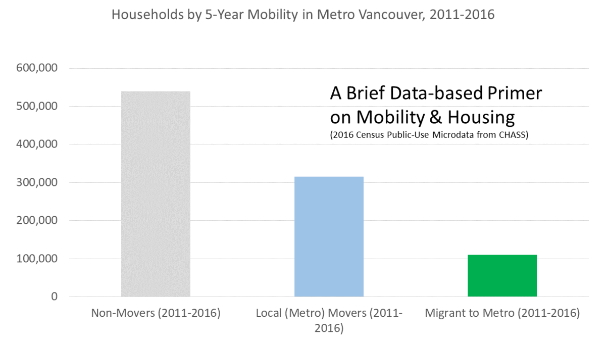
The data comes from Public Use Microdata File (PUMF) for the 2016 Census. I drew upon the easily extractable release of the data from the CHASS Data Centre at U. Toronto (the hierarchical file), looking only at household heads within Metro Vancouver (and individual weights as provided). The Census has data on mobility (Did you move since the last census? If so, from where?) and age of current housing as reported by respondents (variable names: mob5 and built), which CHASS enables you to easily download as a series of crosstabs. I also pulled national after-tax economic family income deciles (efdecile) for local movers to show how income distributions differ between those moving into new and older housing. Then I went old-school, using Excel and Powerpoint to make these simple figures and EZGif to animate them. I played around with colours and arrows to indicate the main message I wanted to get across, and cleaned up minor aspects of the analysis (for instance, some non-movers live in new housing, which may represent multiple issues, but probably mostly has to do mostly with the mismatch in timing between year built and having moved in the last year in the census, so I grayed this tiny band out to avoid distraction and keep the focus on movers and new housing).
I made the judgment that talking about other issues would also add appropriate complexity to the analysis, but detract from getting across the main points and require introducing more data. Perhaps the biggest issue here is that I left out discussion of all those households that left the Metro Area. They generally leave behind old housing at their departure which adds to the stock available for everyone else to occupy. I also focused on housing occupied by usual residents. We’ve got a whole other post on so-called “Empty Homes” which mostly aren’t empty (and for Metro Vancouver we’ve also now got Speculation and Vacancy Tax results galore demonstrating very few properties stay empty long enough to get hit with a tax). On the whole, there’s always a balance between getting across the underlying dynamic of importance to readers and introducing all the complexities that keep life interesting (for me) but easily obscure the message for a general audience. Happy to take more suggestions, and I’ll keep working on it!
